← CASE STUDIES
CASE STUDY · MOVING · LOGISTICS · NATIONWIDE
SMOOVE MOVE
A moving company whose website was costing it jobs. We rebuilt the logo, the brand around it, and the landing page.
- THE JOB
- LOGO REBRANDBRAND IDENTITYLANDING PAGEHERO VIDEO
- TRADE
- MOVING · LOGISTICS
- YEAR
- 2024
/01
WHAT THEY HAD.
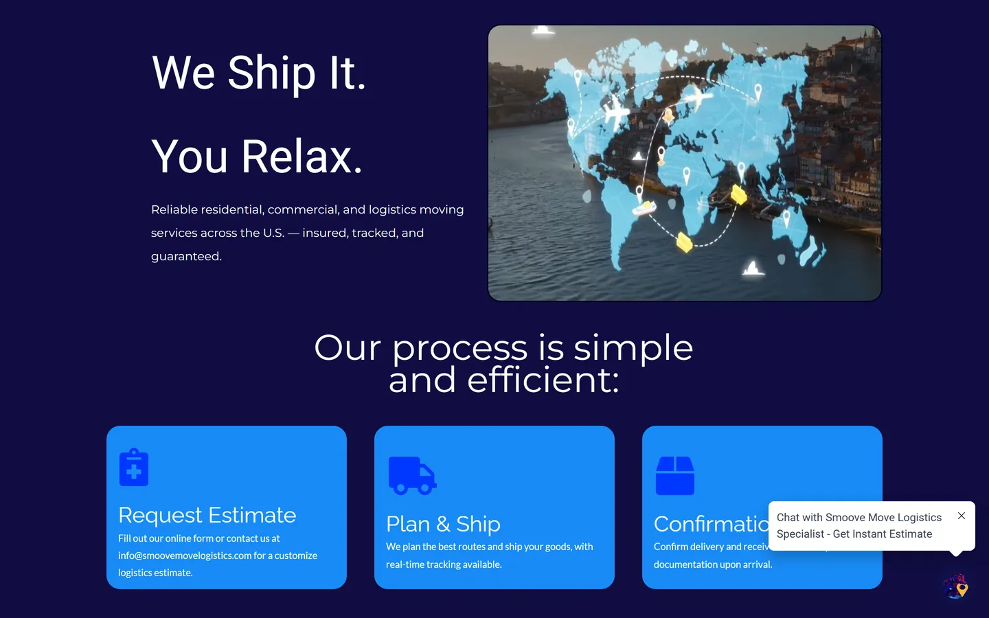
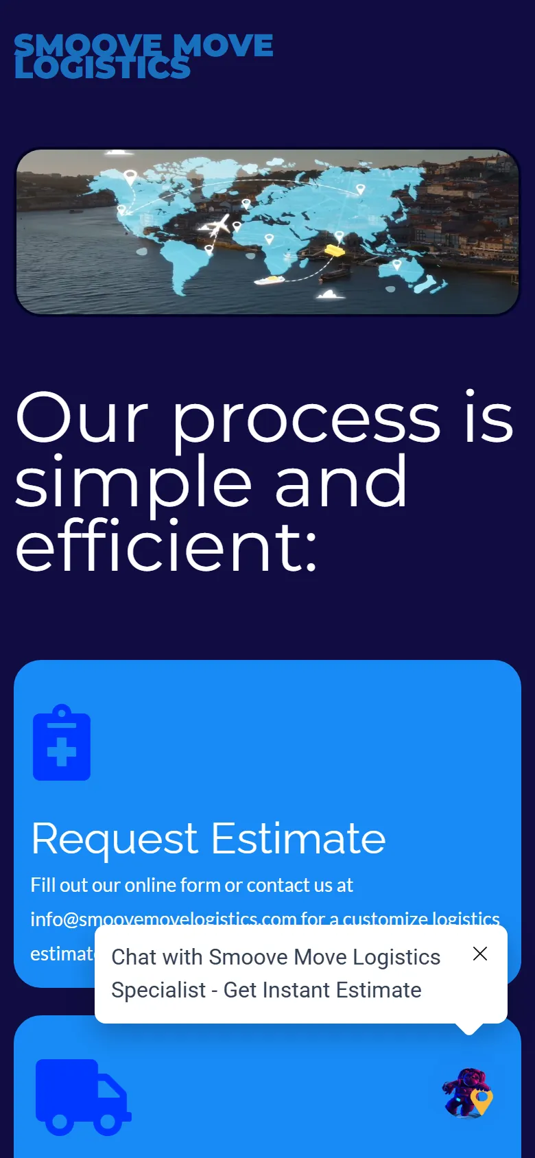
The old site looked like it came out of a template builder. A fake helper bot popped up over the page asking you to chat with a specialist, the navigation was hard to follow, and the layout was crowded.
The company sells a premium move. The website made it look like a guess. On a phone the name ran into itself before you'd scrolled an inch.
THE AFTER.
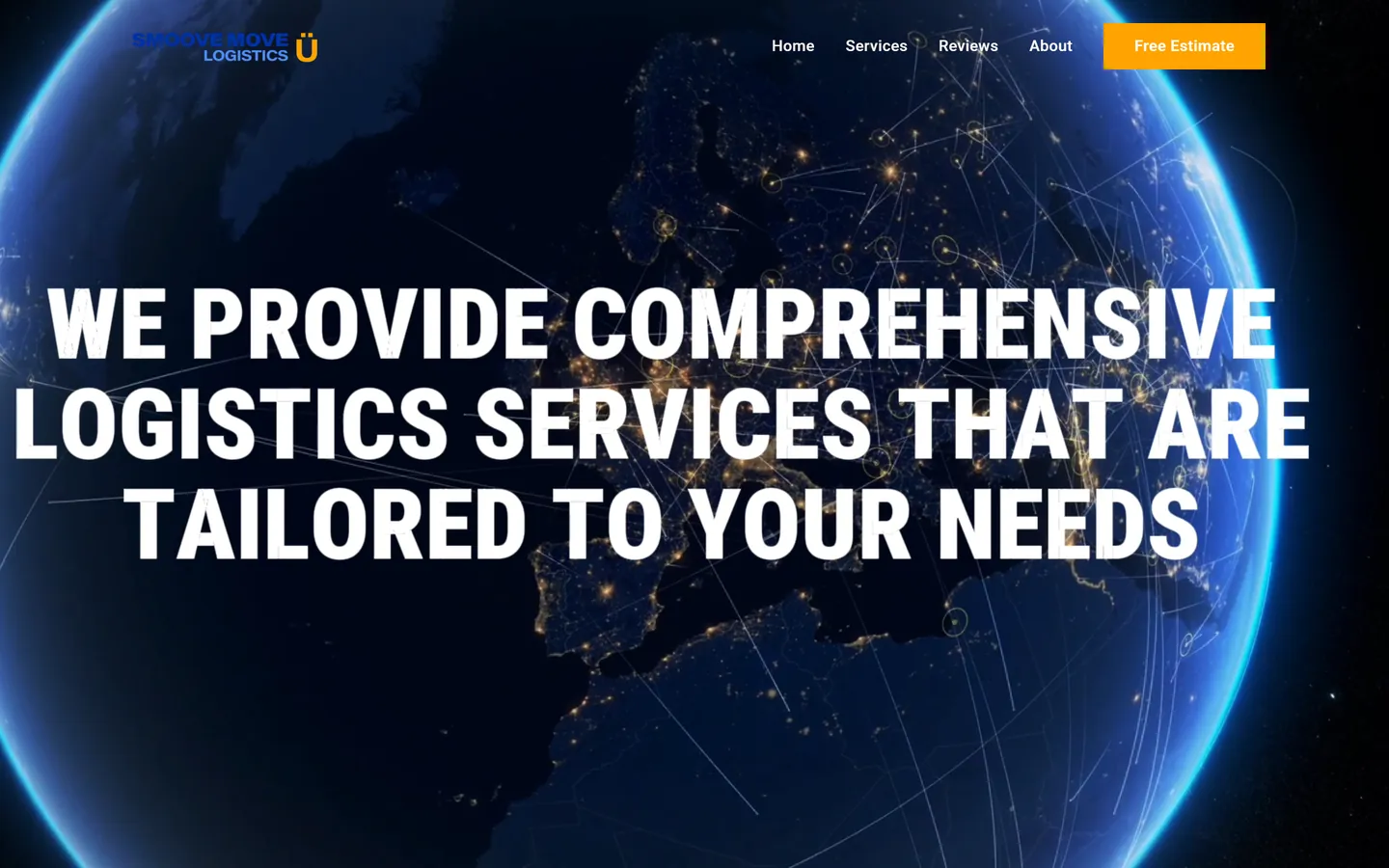 SMOOVE MOVE, NOW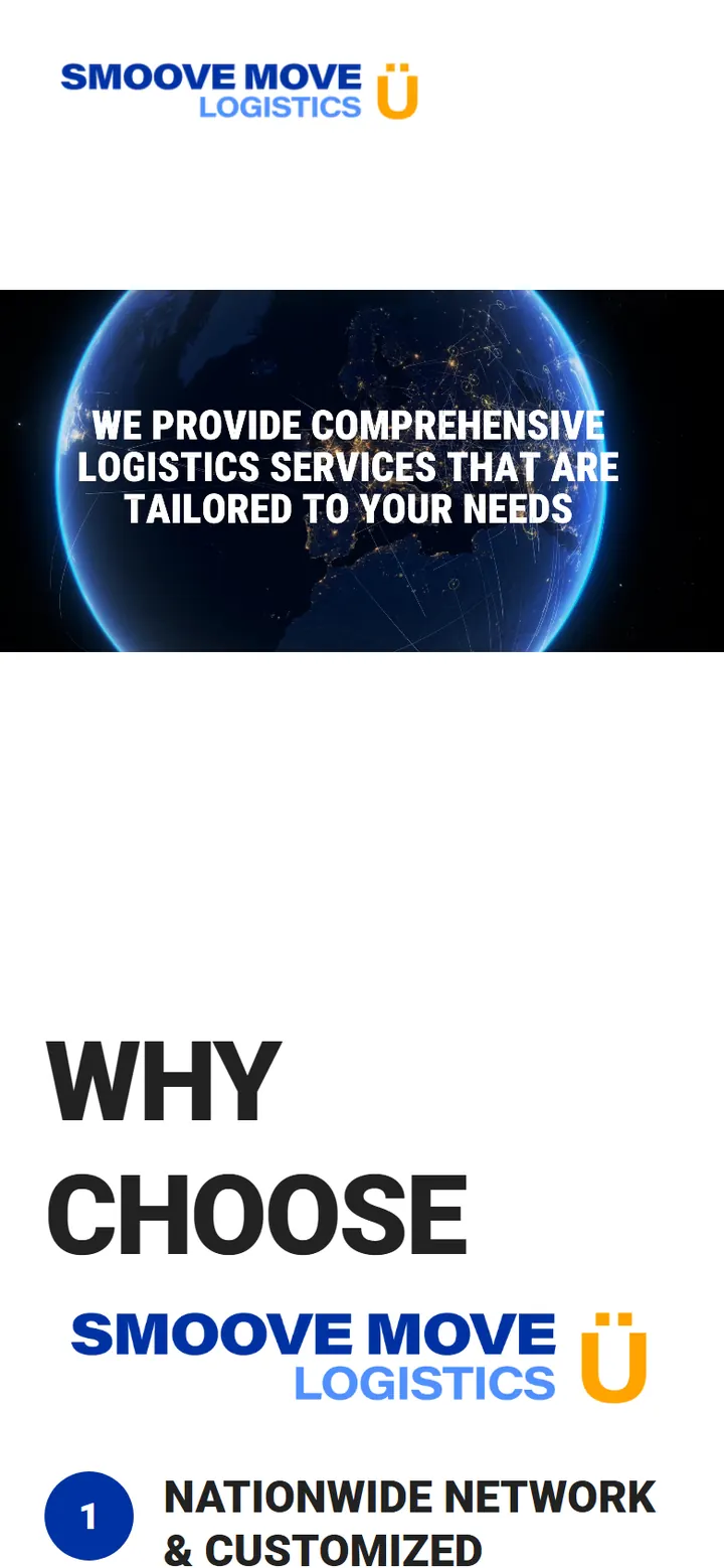
/02
WHAT WE DID.
- 01A new logo: a wordmark with a Ü that also works on its own as the icon.
- 02A five-color palette named for a launch, and an astronaut mascot to carry it.
- 03One typeface, Roboto, with the weights doing the work of the hierarchy.
- 04A landing page built from scratch, with a full-screen video of their crews up top.
- 05The fake bot gone. The phone number is one tap and the estimate is three steps.
- 06Their Google reviews on the page, and the six services laid out in a grid.
“I had a vision for what I wanted, but I couldn't execute it myself. OPTICBURNER took that concept and brought it to life perfectly. The design exceeded my expectations. They understood exactly what I was going for and delivered something even better than I imagined.”
/03 THE BRAND
THE PIECES.
- LIFTOFF#FFA300
- STRATOSPHERE#508FFF
- ORBIT#0032A3
- COSMOS#2B1E59
- MISSION CONTROL#222222

THE LOGO 
THE Ü ICON 
THE ASTRONAUT MASCOT 
ONE COLOR: BLACK 
ONE COLOR: WHITE
YOURS COULD BE NEXT.
Pick the parts, see the price, send it over. No discovery call.